Description:
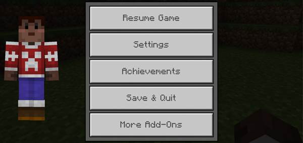
The pause screen has been redesigned to look more minimalistic. The adjustments are subtle but personally I think they are a great improvement as it removes some of the clutter which I’ve never up until this point have found useful anyway.
Creator: RyFol, Twitter Account
What is changed?
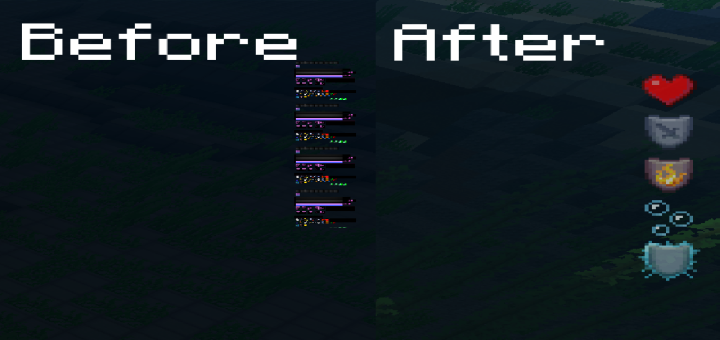
The main difference which you will notice is that the list of players in your current world is removed. A new feature is the rendered player model which is displayed on the left side of the screen. It works with any type of skin.
There is also one new button (“More Add-Ons”) which leads to MCPEDL.com. (Thank you, Ry!)

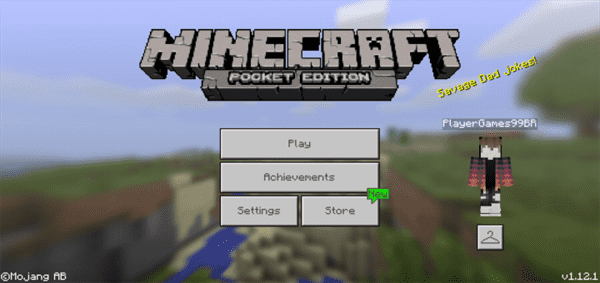
If you don’t remember the original look (without the use of any texture packs) then have a look at the image down below to refresh your memory.

Which do you think look better? You decide!
Installation
- Download Resource .McPack
- Open Minecraft PE
- Go to Settings> Global resources> Activate the resource pack
- Restart Minecraft PE

